About this project…
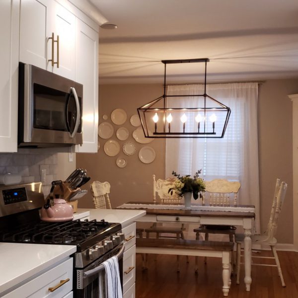
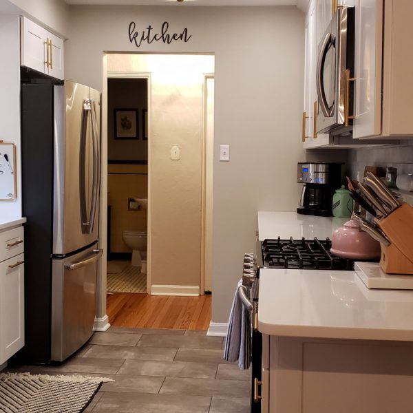
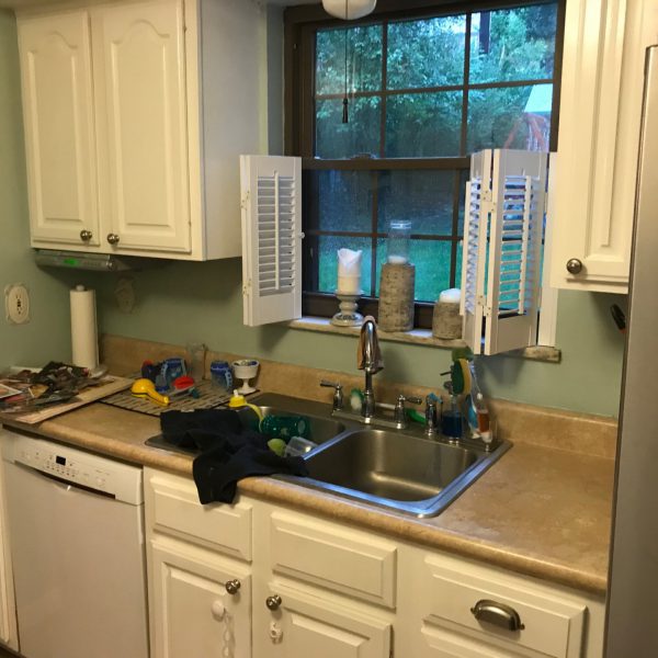
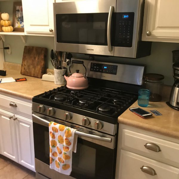
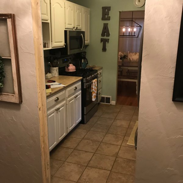
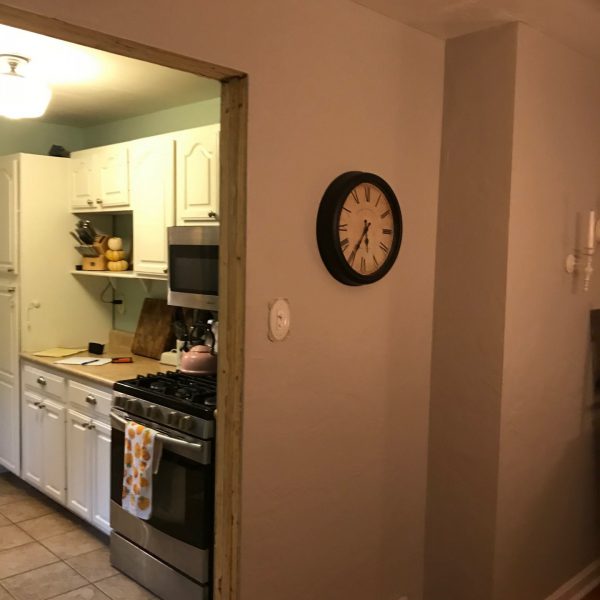
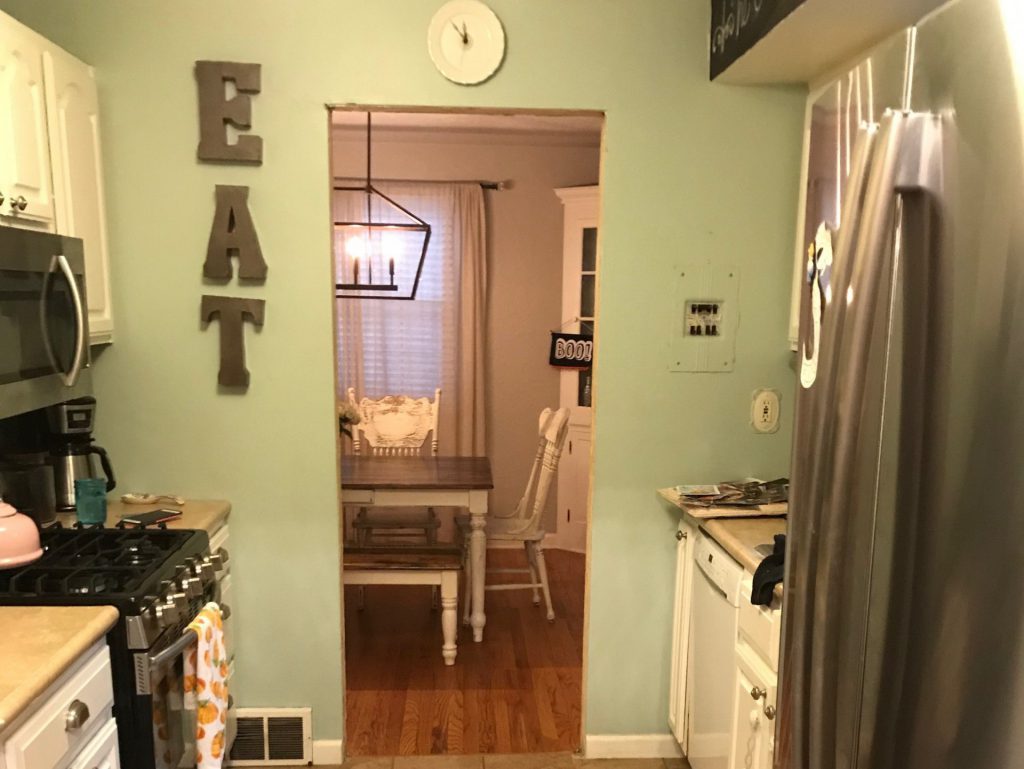
This client’s kitchen was small and closed in with wing walls on both sides of the space. They wanted to improve the flow and create a cleaner look and style that reflected their taste.
(To view before and after images, hold finger or cursor on arrows then slide left or right to reveal images)
What we did…
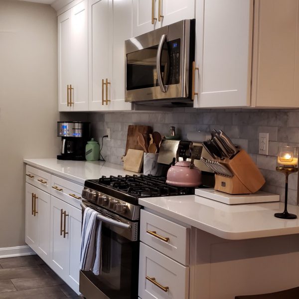
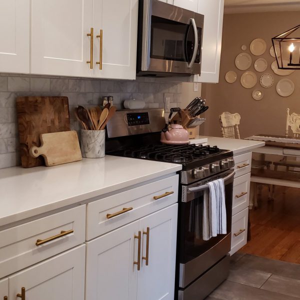
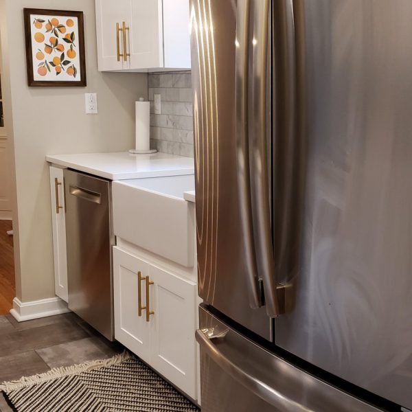
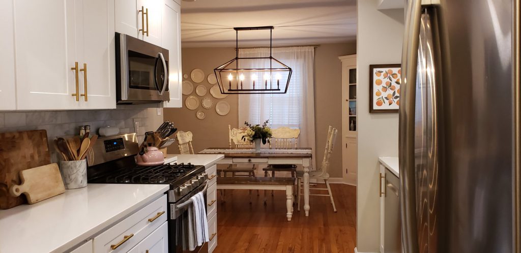
We opened up three of the wing walls and removed one wing wall entirely. This helped to improve the flow and visually open the kitchen up to the dining room making the space feel bigger. To provide a cleaner more modern look, shaker-style cabinets, a farmhouse sink and brushed brass hardware were installed.
Features…
Farmhouse sink, brushed brass hardware, roll-out shelves for easy access storage, small counter with stool.
Final Project Gallery
Before Pictures
Client Comments
Continue ReadingEverybody that we worked with throughout the process truly took the time to go over every detail and really listen to what we wanted. We really trusted their recommendations and guidance through our decision making process and felt very confident going into the project. The end result of our project exceeded out expectations.

